

Google Messages Unveils Major Redesign for Link Previews NOW
BREAKING: Google has just announced a significant redesign of link previews in its popular Google Messages app, rolling out in a beta version aimed at enhancing user experience. This urgent update transforms the way links are displayed, shifting from a bulky card-style format to a compact and minimalist design that prioritizes brevity and visual clarity.
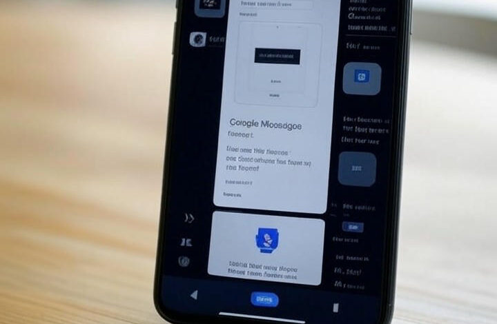
The new link previews, which are already visible in the latest beta version, eliminate the extensive previews that cluttered conversations. Instead, users will now see concise snippets that include only the domain name, a brief title, and a small thumbnail. This change is designed to reduce visual noise, particularly beneficial in busy group chats where links are frequently shared.
This redesign is part of Google’s ongoing efforts to modernize its Android ecosystem, responding directly to user feedback regarding clutter and usability. Observers note that this move aligns with Google’s Material You design language, which emphasizes efficiency and personalization across its applications.
Additionally, the redesign introduces subtle animations and color adaptations that match users’ themes, fostering a more cohesive Android experience. While the goal is to improve load times and data usage—especially for users on slower networks—some beta testers have raised concerns about potential downsides. They worry that the simplified format may obscure essential context, leading to unintentional clicks on unsafe links.
EXPERT INSIGHT: According to a report from Android Police, this update is not Google’s first venture into refining link previews. Past efforts have included the integration of basic previews in anticipation of features like dark mode. The implications for user engagement are significant, as this shift reflects a broader trend toward minimalism in mobile interfaces, balancing information density with readability.
Furthermore, security experts warn that while condensed previews may streamline the user experience, they could inadvertently increase phishing risks if users become less vigilant about checking visible URLs. Discussions from Android Authority emphasize the importance of scrutinizing domains, encouraging better digital hygiene among users.
Looking ahead, this beta rollout is part of Google’s broader strategy to introduce Material 3 Expressive elements across its suite of applications, with similar updates seen in Gmail and Calendar. Users have reported staggered implementations, indicating that Google is testing the waters before a full-scale launch, potentially aligned with the anticipated release of Android 16.
As the redesign evolves, industry insiders speculate it could extend to web versions of Google Messages, enhancing cross-device consistency. This transformation aims to make the Android interface feel more dynamic and engaging, amid fierce competition from messaging apps like WhatsApp and Telegram.
USER REACTION: However, not all feedback is positive. Some users express nostalgia for the detailed previews of news articles and product links, arguing the new format sacrifices informativeness for aesthetics. As Google navigates these trade-offs, the pressure mounts, especially with competitors like Samsung transitioning to Google’s messaging platform.
In conclusion, this redesign highlights Google’s commitment to iterative improvements, balancing innovation with practicality. As beta testing continues, it remains to be seen how these changes will affect daily messaging habits and whether they will position Google Messages as a leader in the crowded communication tools market. Stay tuned for more updates on this developing story!